The Olist Analytics Warehouse
A 10-notebook system that turns raw marketplace data into answers a business can act on.
In plain language, this project shows:
- Who your best customers and sellers are.
- Which products and categories actually drive revenue.
- How well deliveries, payments, and reviews are performing over time.
Each notebook uses the same simple pattern: business question → clean data → SQL → clear chart → takeaways. It’s designed so both technical and non-technical people can quickly see how structured analytics turns messy tables into clear, decision-ready insight.
Tools & Tech Stack
- Databricks Notebooks — interactive workspace for SQL + Python analytics.
- DuckDB — in-notebook analytics engine with a star schema for Olist data.
- Python & Pandas — data loading, cleaning, feature tables, and tests.
- SQL — CTE-based metric logic, joins, and governance/consistency checks.
- Plotly — interactive charts embedded directly into the analytic cards.
- VS Code & Jupyter — local development for ETL scripts and unit tests.
- Kaggle + kagglehub — reproducible dataset download and raw file management.
This notebook answers the classic product question: “Is the customer base actually healthy?” It measures monetization (AOV), repeat behavior, time to reorder, and end-to-end funnel survival.
01 · Customers
Analytics covered in this notebook
Each analytic below mirrors exactly what runs in Databricks: same tables, same SQL. The explanations focus on why each metric exists and how the query is structured.
Question: Which regions generate higher-value baskets?
We first aggregate payments to the order level (order_values CTE), then join orders
to customers and roll up to customer_state. This produces an AOV per state plus how
many orders and unique customers are behind that number.
- AOV:
AVG(order_value)percustomer_state. - Volume:
COUNT(DISTINCT order_id). - Customer base:
COUNT(DISTINCT customer_unique_id).
Why this matters: not all geographic growth is equally valuable. Some states can be low AOV / high volume (thin margin), while others are high AOV / lower volume (strategic).
Key SQL ideas:
- CTE pattern to keep revenue logic centralized.
- Explicit
GROUP BY customer_stateon the dimension, not the raw ID. - Sorting by
avg_order_value DESCto spotlight top states.

Key insight. High-AOV states represent pricing power and are prime candidates for premium assortment and upsell campaigns, while low-AOV regions are better suited to volume growth and cost-efficiency plays.
Show SQL
WITH order_values AS (
    SELECT
        fp.order_id,
        SUM(fp.payment_value) AS order_value
    FROM fact_payments fp
    GROUP BY fp.order_id
)
SELECT
    c.customer_state,
    AVG(ov.order_value)                  AS avg_order_value,
    COUNT(DISTINCT o.order_id)           AS total_orders,
    COUNT(DISTINCT c.customer_unique_id) AS unique_customers
FROM order_values ov
JOIN fact_orders   o ON ov.order_id   = o.order_id
JOIN dim_customer  c ON o.customer_id = c.customer_id
GROUP BY c.customer_state
ORDER BY avg_order_value DESC;
For each customer_unique_id we count distinct orders to get an order_count.
Then we bucket customers by that count and compute the percentage of the base in each bucket.
This shows how “sticky” the marketplace is: what share is one-and-done vs. multi-order vs. heavy power users.
Key mechanics:
customer_ordersCTE aggregates orders per customer.- Main query groups by
order_countand usesSUM(COUNT(*)) OVER ()to get the denominator for percentages. pct_customers= percent of the total base in that bucket.
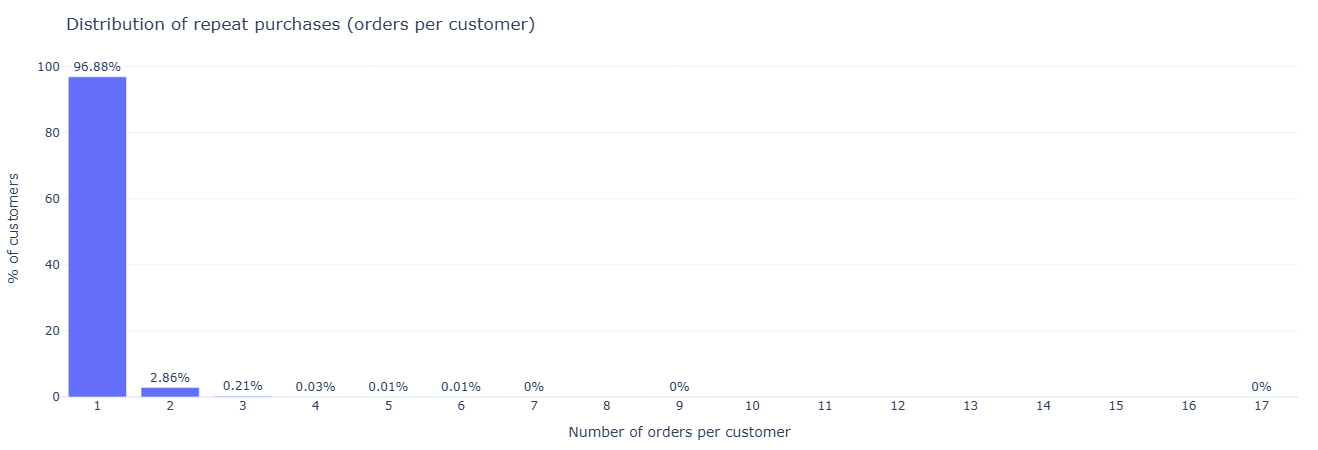
Key insight. If most customers buy only once, growth is disproportionately dependent on new acquisition; shifting even a small share of one-and-done buyers into 2–3 order cohorts materially improves revenue efficiency.
Show SQL
WITH customer_orders AS (
    SELECT
        c.customer_unique_id,
        COUNT(DISTINCT o.order_id) AS order_count
    FROM fact_orders o
    JOIN dim_customer c ON o.customer_id = c.customer_id
    GROUP BY c.customer_unique_id
)
SELECT
    order_count,
    COUNT(*) AS num_customers,
    ROUND(100.0 * COUNT(*) / SUM(COUNT(*)) OVER (), 2) AS pct_customers
FROM customer_orders
GROUP BY order_count
ORDER BY order_count;
For each customer, we sort their purchases by timestamp and use LAG to reference
the previous order date. The difference in days between current and previous orders becomes
days_between_orders.
This is the “heartbeat” of repeat purchasing behavior and is the backbone for churn / reactivation models.
Two-step structure:
orderedCTE: computeorder_tsandprev_order_tspercustomer_unique_id.- Outer query: filters to rows where
prev_order_tsis present and computesDATE_DIFF('day', prev_order_ts::DATE, order_ts::DATE).
A follow-up query then summarizes the gap with AVG and MEDIAN to give
topline re-order cadence.
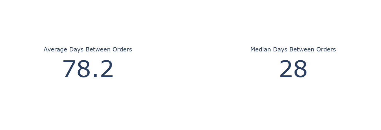
Key insight. With a median re-order gap around one month and a much longer average, lifecycle messaging should target the 3–5 week window for replenishment offers, with separate reactivation journeys beyond the 2–3 month mark.
Show SQL (gap distribution + summary stats)
WITH ordered AS (
    SELECT
        c.customer_unique_id,
        CAST(o.order_purchase_timestamp AS TIMESTAMP) AS order_ts,
        LAG(CAST(o.order_purchase_timestamp AS TIMESTAMP))
            OVER (
                PARTITION BY c.customer_unique_id
                ORDER BY CAST(o.order_purchase_timestamp AS TIMESTAMP)
            ) AS prev_order_ts
    FROM fact_orders o
    JOIN dim_customer c ON o.customer_id = c.customer_id
)
SELECT
    customer_unique_id,
    DATE_DIFF('day', prev_order_ts::DATE, order_ts::DATE) AS days_between_orders
FROM ordered
WHERE prev_order_ts IS NOT NULL;
SELECT
    AVG(days_between_orders)    AS avg_days_between_orders,
    MEDIAN(days_between_orders) AS median_days_between_orders
FROM (
    SELECT
        DATE_DIFF('day', prev_order_ts::DATE, order_ts::DATE) AS days_between_orders
    FROM (
        SELECT
            c.customer_unique_id,
            CAST(o.order_purchase_timestamp AS TIMESTAMP) AS order_ts,
            LAG(CAST(o.order_purchase_timestamp AS TIMESTAMP))
                OVER (
                    PARTITION BY c.customer_unique_id
                    ORDER BY CAST(o.order_purchase_timestamp AS TIMESTAMP)
                ) AS prev_order_ts
        FROM fact_orders o
        JOIN dim_customer c ON o.customer_id = c.customer_id
    )
    WHERE prev_order_ts IS NOT NULL
);
Starting from all rows in fact_orders, we compute stage counts and
funnel-style percentages:
- Orders with an approval timestamp.
- Orders with a carrier handoff timestamp.
- Orders with a delivered timestamp.
This shows how many orders “fall out of the pipe” and where to investigate operational issues.
Mechanics: DuckDB counts non-null values for each timestamp column:
COUNT(order_approved_at)→ approved orders.COUNT(order_delivered_carrier_date)→ shipped.COUNT(order_delivered_customer_date)→ delivered.
Percentages are just each count divided by COUNT(*) of all orders.
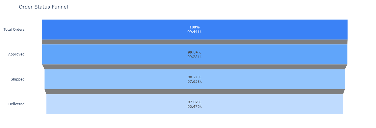
Key insight. Even 1–2 percentage-point losses between approval, shipment, and delivery translate into tens of thousands of impacted orders, so focusing improvement efforts on the stage with the largest drop yields the highest operational leverage.
Show SQL
SELECT
    COUNT(*) AS total_orders,
    COUNT(order_approved_at)             AS approved_orders,
    COUNT(order_delivered_carrier_date)  AS shipped_orders,
    COUNT(order_delivered_customer_date) AS delivered_orders,
    ROUND(100.0 * COUNT(order_approved_at)            / COUNT(*), 2) AS pct_approved,
    ROUND(100.0 * COUNT(order_delivered_carrier_date) / COUNT(*), 2) AS pct_shipped,
    ROUND(100.0 * COUNT(order_delivered_customer_date) / COUNT(*), 2) AS pct_delivered
FROM fact_orders;
This notebook reframes Olist as an operations problem: How fast do we deliver, where are we slow, and which sellers or categories introduce risk? It measures delivery time by city/state, delay vs estimate by seller, delivery speed by category, and lead time variance per seller.
02 · Logistics
Analytics covered in this notebook
These queries shift focus from “who buys?” to “how reliably do we ship and deliver?” Each card surfaces a different operational lens.
For each delivered order, we compute delivery_days from purchase to customer delivery.
We then roll up to customer_state + customer_city, computing:
avg_delivery_daysp50_delivery_days(median)total_ordersper city
Outliers (negative durations) are filtered out with delivery_days >= 0.
Use cases: feed this into maps/heatmaps, spot slow cities, and prioritize carrier or SLA changes.
Key SQL: simple WITH delivery CTE computing date diff, then grouped by geo.

Key insight. Cities and states with systematically longer delivery times highlight where carrier mix, route design, or local SLAs should be reviewed before additional volume is pushed into those regions.
Show SQL
WITH delivery AS (
    SELECT
        o.order_id,
        c.customer_state,
        c.customer_city,
        date_diff(
            'day',
            CAST(o.order_purchase_timestamp      AS TIMESTAMP),
            CAST(o.order_delivered_customer_date AS TIMESTAMP)
        ) AS delivery_days
    FROM fact_orders o
    JOIN dim_customer c
      ON o.customer_id = c.customer_id
    WHERE o.order_delivered_customer_date IS NOT NULL
)
SELECT
    customer_state,
    customer_city,
    AVG(delivery_days)    AS avg_delivery_days,
    MEDIAN(delivery_days) AS p50_delivery_days,
    COUNT(*)              AS total_orders
FROM delivery
WHERE delivery_days >= 0
GROUP BY customer_state, customer_city
ORDER BY avg_delivery_days;
We compute delay_days as delivered - estimated.
Positive values mean late; negative values mean early.
Then we aggregate by seller:
- Average & median delay.
- Count of late orders.
- Total orders per seller (with a minimum of 20 to avoid tiny samples).
Sorting by avg_delay_days DESC gives a ranked list of “most delay-prone sellers” —
a natural input for ops interventions and marketplace policy.

Key insight. Sellers with consistently positive delay_days are clear candidates for performance interventions, tighter SLAs, or reduced search and promotion exposure to protect the overall delivery promise.
Show SQL
WITH order_delays AS (
    SELECT
        oi.seller_id,
        o.order_id,
        date_diff(
            'day',
            CAST(o.order_estimated_delivery_date AS TIMESTAMP),
            CAST(o.order_delivered_customer_date AS TIMESTAMP)
        ) AS delay_days
    FROM fact_order_items oi
    JOIN fact_orders o
      ON oi.order_id = o.order_id
    WHERE o.order_delivered_customer_date IS NOT NULL
      AND o.order_estimated_delivery_date IS NOT NULL
)
SELECT
    s.seller_id,
    s.seller_state,
    AVG(delay_days)    AS avg_delay_days,
    MEDIAN(delay_days) AS p50_delay_days,
    SUM(CASE WHEN delay_days > 0 THEN 1 ELSE 0 END) AS late_orders,
    COUNT(*)                                     AS total_orders
FROM order_delays d
JOIN dim_seller s
  ON d.seller_id = s.seller_id
GROUP BY s.seller_id, s.seller_state
HAVING total_orders >= 20
ORDER BY avg_delay_days DESC;
Some categories are inherently slower to ship (oversized, fragile, specialized shipping).
This query computes delivery days by product_category_name and filters down to
categories with at least 100 delivered items.
Outputs per category:
- Average & median delivery days.
- Total items delivered in that category.
Sorted by average delivery time to surface the slowest categories first.
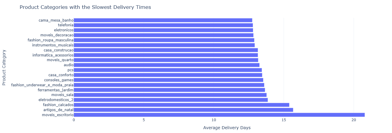
Key insight. Categories with structurally longer delivery times may require differentiated promise dates, pricing that reflects higher logistics cost, or targeted inventory placement closer to demand to keep experience expectations realistic.
Show SQL
WITH delivery AS (
    SELECT
        p.product_category_name,
        datediff(
            'day',
            CAST(o.order_purchase_timestamp      AS TIMESTAMP),
            CAST(o.order_delivered_customer_date AS TIMESTAMP)
        ) AS delivery_days
    FROM fact_order_items oi
    JOIN fact_orders o
        ON oi.order_id = o.order_id
    JOIN dim_product p
        ON oi.product_id = p.product_id
    WHERE o.order_delivered_customer_date IS NOT NULL
)
SELECT
    product_category_name AS category,
    AVG(delivery_days)    AS avg_delivery_days,
    MEDIAN(delivery_days) AS p50_delivery_days,
    COUNT(*)              AS total_items
FROM delivery
GROUP BY product_category_name
HAVING total_items >= 100
ORDER BY avg_delivery_days DESC;
Here we look at full lead time per seller:
lead_time_days = delivered - purchase.
Instead of just average, we focus on variance using STDDEV_POP.
High variance = unpredictable experience.
Outputs per seller:
avg_lead_time_dayslead_time_stddev(variability).total_orders, filtered for ≥20 for stability.
Sorted by stddev descending: “which sellers are the most erratic?”

Key insight. High variance in lead_time_days signals unreliable experience; steering more volume toward low-variance sellers can improve perceived reliability even when average delivery speed is similar.
Show SQL
WITH lead_times AS (
    SELECT
        oi.seller_id,
        date_diff(
            'day',
            CAST(o.order_purchase_timestamp      AS TIMESTAMP),
            CAST(o.order_delivered_customer_date AS TIMESTAMP)
        ) AS lead_time_days
    FROM fact_order_items oi
    JOIN fact_orders o
      ON oi.order_id = o.order_id
    WHERE o.order_delivered_customer_date IS NOT NULL
)
SELECT
    s.seller_id,
    s.seller_state,
    AVG(lead_time_days)        AS avg_lead_time_days,
    STDDEV_POP(lead_time_days) AS lead_time_stddev,
    COUNT(*)                   AS total_orders
FROM lead_times lt
JOIN dim_seller s
  ON lt.seller_id = s.seller_id
WHERE lead_time_days >= 0
GROUP BY s.seller_id, s.seller_state
HAVING total_orders >= 20
ORDER BY lead_time_stddev DESC;
This notebook treats Olist as a payments and monetization system: which payment types drive revenue, how installments behave, and how revenue concentrates in the customer base and categories.
03 · Payments
Analytics covered in this notebook
The following cards track payment types, installment structures, customer revenue tiers, category-level revenue, and multi-method payment patterns.
We classify each order into a simple ticket band:
high_ticket if order value ≥ 200, otherwise regular.
We then cross payment type with ticket band to understand:
- How many payments and orders each combination represents.
- Average order value per combination.
- Total revenue per payment_type × band.
This shows, for example, whether credit card dominates high-ticket orders and whether alternative methods skew to smaller baskets.

Key insight. Seeing which payment types dominate high_ticket versus regular orders helps decide where to promote credit-based options, tighten risk controls, or encourage lower-cost methods without hurting large-basket conversion.
Show SQL
WITH order_totals AS (
    SELECT
        order_id,
        SUM(payment_value) AS order_value
    FROM fact_payments
    GROUP BY order_id
),
labeled_orders AS (
    SELECT
        p.order_id,
        p.payment_type,
        t.order_value,
        CASE
            WHEN t.order_value >= 200 THEN 'high_ticket'
            ELSE 'regular'
        END AS ticket_band
    FROM fact_payments p
    JOIN order_totals t USING (order_id)
)
SELECT
    payment_type,
    ticket_band,
    COUNT(*)                 AS num_payments,
    COUNT(DISTINCT order_id) AS num_orders,
    AVG(order_value)         AS avg_order_value,
    SUM(order_value)         AS total_revenue
FROM labeled_orders
GROUP BY payment_type, ticket_band
ORDER BY total_revenue DESC;
We bucket orders by payment_installments into bands:
1, 2–3, 4–6, 7–12, and 13+.
For each band we compute:
- Number of orders.
- Average, min, max order value.
This reveals how customers use installments and which band carries which kind of ticket size.
Mechanics:
order_paymentsCTE aggregates order value and finds max installments per order.- CASE expression maps numeric installments into human-readable buckets.
- Ordering by a CASE expression preserves the logical order of buckets.
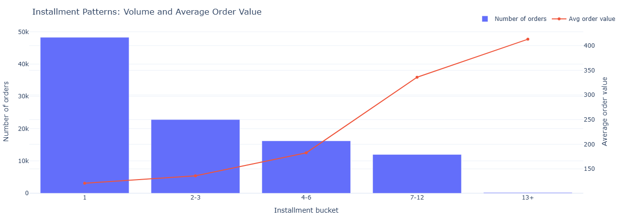
Key insight. Lower buckets (1–3 installments) carry most of the volume, while higher buckets concentrate larger tickets, guiding where to tune financing offers and underwriting so revenue grows without taking on unnecessary risk.
Show SQL
WITH order_payments AS (
    SELECT
        order_id,
        SUM(payment_value)        AS order_value,
        MAX(payment_installments) AS installments
    FROM fact_payments
    GROUP BY order_id
)
SELECT
    CASE
        WHEN installments = 1                  THEN '1'
        WHEN installments BETWEEN 2 AND 3      THEN '2-3'
        WHEN installments BETWEEN 4 AND 6      THEN '4-6'
        WHEN installments BETWEEN 7 AND 12     THEN '7-12'
        ELSE '13+'
    END AS installment_bucket,
    COUNT(*)         AS orders,
    AVG(order_value) AS avg_order_value,
    MIN(order_value) AS min_order_value,
    MAX(order_value) AS max_order_value
FROM order_payments
GROUP BY installment_bucket
ORDER BY
    CASE installment_bucket
        WHEN '1'   THEN 1
        WHEN '2-3' THEN 2
        WHEN '4-6' THEN 3
        WHEN '7-12' THEN 4
        ELSE 5
    END;
This analytic asks: How concentrated is revenue? We compute total revenue per customer, bucket them into 10 deciles by revenue, and then calculate:
- What % of revenue comes from the top 10% of customers.
- What % of the customer base those top 10% represent.
Key concept: NTILE(10) over revenue descending gives deciles,
with decile 1 = highest revenue customers. This is a classic Pareto-style view.
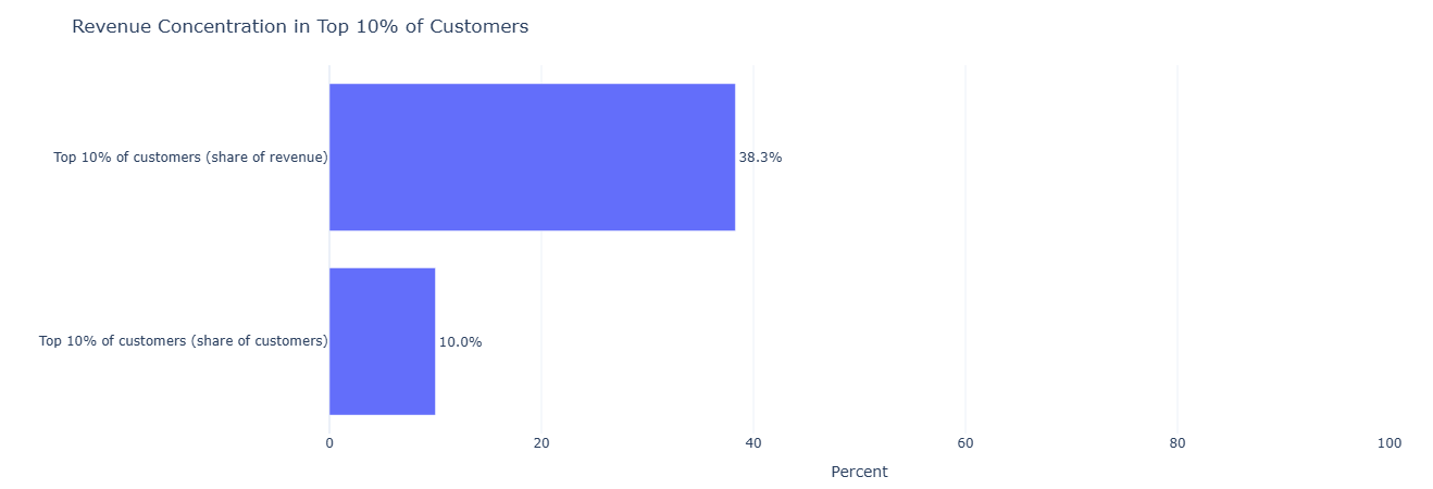
Key insight. A high share of revenue coming from the top 10% of customers signals that targeted retention and service-level commitments for this segment can materially protect the overall P&L.
Show SQL
WITH customer_revenue AS (
    SELECT
        o.customer_id,
        SUM(p.payment_value) AS revenue
    FROM fact_orders   o
    JOIN fact_payments p USING (order_id)
    GROUP BY o.customer_id
),
ranked AS (
    SELECT
        customer_id,
        revenue,
        NTILE(10) OVER (ORDER BY revenue DESC) AS revenue_decile
    FROM customer_revenue
)
SELECT
    SUM(CASE WHEN revenue_decile = 1 THEN revenue ELSE 0 END) * 1.0
    / SUM(revenue)                          AS top10_pct_of_revenue,
    SUM(CASE WHEN revenue_decile = 1 THEN 1 ELSE 0 END) * 1.0
    / COUNT(*)                              AS top10_pct_of_customers
FROM ranked;
We approximate item-level revenue with price + freight_value, aggregate to product,
then roll up to product_category_name and order by total_revenue.
Only the top 20 categories are shown to keep the surface manageable.
Why price + freight? It’s a simple proxy for total economic value of a line item to the platform (what the customer pays to get it delivered).

Key insight. The top revenue categories define where assortment, pricing tests, and merchandising changes will have the largest impact, while long-tail categories are better candidates for rationalization or curated experimentation.
Show SQL
WITH item_revenue AS (
    SELECT
        oi.product_id,
        SUM(oi.price + oi.freight_value) AS revenue
    FROM fact_order_items oi
    GROUP BY oi.product_id
)
SELECT
    p.product_category_name,
    SUM(ir.revenue) AS total_revenue
FROM item_revenue ir
JOIN dim_product p USING (product_id)
GROUP BY p.product_category_name
ORDER BY total_revenue DESC
LIMIT 20;
Some orders have a single payment row, some are split across multiple rows, and some use multiple payment methods. We classify each order as:
single_method_single_rowsingle_method_split(same method, multiple rows)multiple_methods
For each pattern we compute count of orders, average order value, and total revenue.

Key insight. Understanding how many orders use split or multi-method payments clarifies how complex typical transactions are and whether checkout, reconciliation, or fraud tooling should be optimized for single-method or multi-method flows.
Show SQL
WITH payment_stats AS (
    SELECT
        order_id,
        COUNT(*)                     AS payment_rows,
        COUNT(DISTINCT payment_type) AS payment_types,
        SUM(payment_value)           AS total_value
    FROM fact_payments
    GROUP BY order_id
)
SELECT
    CASE
        WHEN payment_types = 1 AND payment_rows = 1
            THEN 'single_method_single_row'
        WHEN payment_types = 1 AND payment_rows > 1
            THEN 'single_method_split'
        WHEN payment_types > 1
            THEN 'multiple_methods'
    END AS payment_pattern,
    COUNT(*)         AS orders,
    AVG(total_value) AS avg_order_value,
    SUM(total_value) AS total_revenue
FROM payment_stats
GROUP BY payment_pattern
ORDER BY orders DESC;
This notebook connects operational reality to customer sentiment. Instead of
treating review_score as a vanity metric, it treats each review
as a diagnostic signal about delays, product categories,
individual sellers, and shipping performance.
- Delay vs review score — how late deliveries drag sentiment.
- Category-level satisfaction — which categories disappoint or delight.
- Seller reputation — stable, data-backed view of “good” vs “risky” sellers.
- NPS-style buckets — detractors, neutrals, and promoters by shipping speed.
- Time-to-review — how quickly happy vs unhappy customers speak up.
Business question: How much do late deliveries actually hurt review scores?
What this measures. For each order with both an
order_estimated_delivery_date and an
order_delivered_customer_date, we compute:
delay_days = delivered - estimated- Positive delay → delivered after estimate (late)
- Negative delay → delivered before estimate (early)
We then join that delay to each order’s review_score and aggregate by score, yielding:
avg_delay_days, median delay, and num_reviews per
rating from 1–5.
This makes it obvious, for example, that 1–2 star reviews cluster around long delays while 5-star reviews cluster around on-time or early deliveries.
Tables used.
fact_orders— estimated vs actual delivery timestamps.fact_reviews—review_scoreand review linkage viaorder_id.
Key SQL ideas.
- CTE
deliverycomputes per-orderdelay_daysfrom two timestamps. - CTE
joinedlinksreview_scoretodelay_daysusingUSING(order_id). - Main SELECT groups by
review_scoreto expose delay patterns per rating.
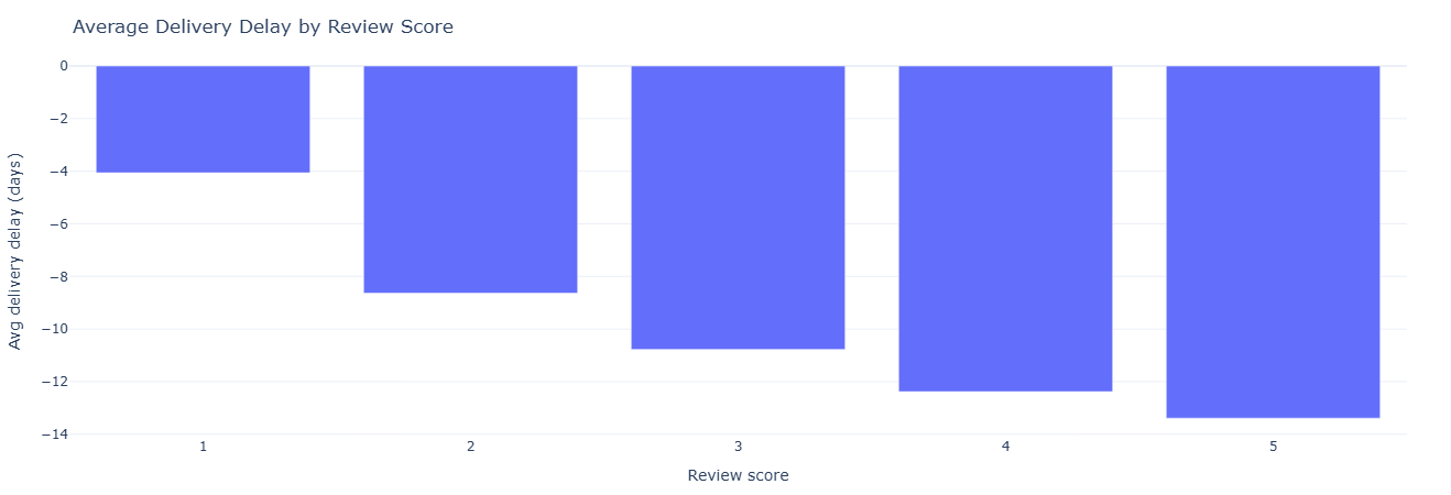
Key insight. The clear drop in review scores as delay_days increases quantifies how costly late deliveries are to perceived quality, supporting investment in delivery reliability as a direct lever on satisfaction.
Full SQL — delay vs score
WITH delivery AS (
    SELECT
        o.order_id,
        -- + = delivered after estimate (late), - = early
        date_diff(
            'day',
            CAST(o.order_estimated_delivery_date AS TIMESTAMP),
            CAST(o.order_delivered_customer_date AS TIMESTAMP)
        ) AS delay_days
    FROM fact_orders o
    WHERE
        o.order_delivered_customer_date IS NOT NULL
        AND o.order_estimated_delivery_date IS NOT NULL
),
joined AS (
    SELECT
        r.order_id,
        r.review_score,
        d.delay_days
    FROM fact_reviews r
    JOIN delivery d USING (order_id)
    WHERE r.review_score IS NOT NULL
)
SELECT
    review_score,
    AVG(delay_days)    AS avg_delay_days,
    MEDIAN(delay_days) AS p50_delay_days,
    COUNT(*)           AS num_reviews
FROM joined
GROUP BY review_score
ORDER BY review_score;
Business question: Which categories consistently delight vs disappoint customers?
What this measures. For every order item with a review, we attach its
product_category_name and then aggregate review stats by category:
num_reviews— sample size for stability.avg_review_score— average satisfaction.p50_review_score— median, reducing sensitivity to outliers.
We filter to categories with at least 100 reviews to avoid noisy, tiny samples. This supports portfolio decisions: which categories need quality focus, better product curation, or different expectations set in marketing.
Tables used.
fact_order_items— item-level linkage between orders and products.dim_product— category names.fact_reviews— review scores per order.
Key SQL ideas.
- CTE
product_reviewsaligns each item to itsproduct_category_nameandreview_score. HAVING num_reviews >= 100keeps the output statistically meaningful.- Ordering by
avg_review_scoresurfaces worst → best categories or vice versa.

Key insight. Categories with persistently lower average or median review scores are natural candidates for deeper quality checks, supplier changes, or expectation-setting in marketing before additional growth spend is deployed.
Full SQL — reviews by category
WITH product_reviews AS (
    SELECT
        p.product_category_name,
        r.review_score
    FROM fact_order_items oi
    JOIN dim_product p      USING (product_id)
    JOIN fact_reviews r     USING (order_id)
    WHERE r.review_score IS NOT NULL
)
SELECT
    product_category_name,
    COUNT(*)             AS num_reviews,
    AVG(review_score)    AS avg_review_score,
    MEDIAN(review_score) AS p50_review_score
FROM product_reviews
GROUP BY product_category_name
HAVING num_reviews >= 100      -- tweak threshold if you want
ORDER BY avg_review_score;
Business question: Which sellers are consistently loved or hated by customers?
What this measures. We attach each review to the seller responsible for fulfilling the underlying item, then aggregate by seller:
num_reviews— how many data points we have for that seller.avg_review_score— mean sentiment.p50_review_score— median satisfaction for robustness.
We filter out sellers with fewer than 50 reviews to focus on those where the signal isn’t dominated by noise. This becomes a reputation leaderboard that can feed into policy, merchandising, and seller management decisions.
Tables used.
fact_order_items— locates the seller for each item.fact_reviews— provides thereview_score.dim_seller— city/state context for mapping and regional insights.
Key SQL ideas.
- CTE
per_sellerreduces down to one row per (seller, review). - Main SELECT joins on
dim_sellerto enrich with geography. HAVING num_reviews >= 50ensures we evaluate sellers on a meaningful sample.
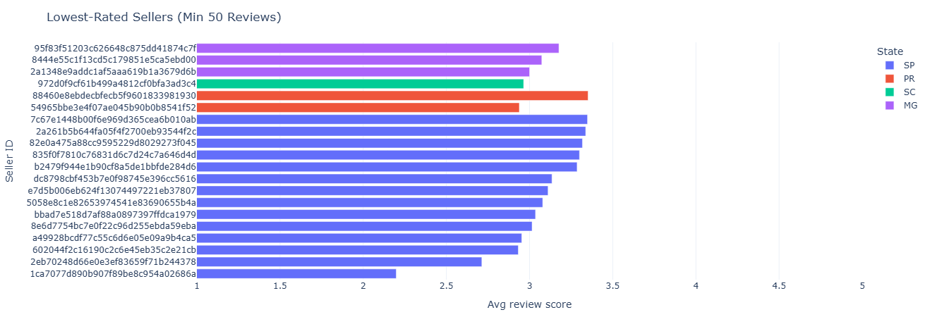
Key insight. A reputation leaderboard by seller enables policy, merchandising, and traffic allocation decisions that reward consistently strong performers and limit exposure to sellers who generate disproportionate dissatisfaction.
Full SQL — seller review stats
WITH per_seller AS (
    SELECT
        oi.seller_id,
        r.review_score
    FROM fact_order_items oi
    JOIN fact_reviews r USING (order_id)
    WHERE r.review_score IS NOT NULL
)
SELECT
    s.seller_id,
    s.seller_city,
    s.seller_state,
    COUNT(*)             AS num_reviews,
    AVG(review_score)    AS avg_review_score,
    MEDIAN(review_score) AS p50_review_score
FROM per_seller ps
JOIN dim_seller s USING (seller_id)
GROUP BY
    s.seller_id,
    s.seller_city,
    s.seller_state
HAVING num_reviews >= 50       -- avoid tiny noisy sellers
ORDER BY avg_review_score;
Business question: How does shipping speed differ between detractors, neutrals, and promoters?
What this measures. We construct a simple NPS-style bucket from review scores:
- 1–2 →
detractor - 3–4 →
neutral - 5 →
promoter
Then we compute shipping_days as delivered - purchased and aggregate
avg and median shipping days per NPS bucket. This directly quantifies how
much faster shipping needs to be to convert detractors into promoters.
Tables used.
fact_orders— purchase and delivery timestamps.fact_reviews— review scores mapped to NPS buckets.
Key SQL ideas.
- CTE
deliverycomputesshipping_daysonly for delivered orders. - CTE
reviewsmaps raw 1–5 scores into NPS-style categories. - Main SELECT groups by
nps_bucketand orders in business-friendly bucket order.

Key insight. When detractors experience meaningfully longer shipping days than promoters, it gives a concrete target for how much faster delivery must be to convert neutral or unhappy customers into promoters.
Full SQL — NPS buckets & shipping
WITH delivery AS (
    SELECT
        o.order_id,
        date_diff(
            'day',
            CAST(o.order_purchase_timestamp       AS TIMESTAMP),
            CAST(o.order_delivered_customer_date AS TIMESTAMP)
        ) AS shipping_days
    FROM fact_orders o
    WHERE o.order_delivered_customer_date IS NOT NULL
),
reviews AS (
    SELECT
        r.order_id,
        r.review_score,
        CASE
            WHEN r.review_score IN (1, 2) THEN 'detractor'
            WHEN r.review_score IN (3, 4) THEN 'neutral'
            WHEN r.review_score = 5        THEN 'promoter'
        END AS nps_bucket
    FROM fact_reviews r
    WHERE r.review_score IS NOT NULL
)
SELECT
    nps_bucket,
    COUNT(*)              AS num_orders,
    AVG(shipping_days)    AS avg_shipping_days,
    MEDIAN(shipping_days) AS p50_shipping_days
FROM reviews r
JOIN delivery d USING (order_id)
WHERE nps_bucket IS NOT NULL
GROUP BY nps_bucket
ORDER BY
    CASE nps_bucket
        WHEN 'promoter'  THEN 1
        WHEN 'neutral'   THEN 2
        WHEN 'detractor' THEN 3
    END;
Business question: How quickly do happy vs unhappy customers leave reviews?
What this measures. For each order with a delivery date and review creation date,
we compute days_to_review = review_creation_date - delivered_date. Then we aggregate by
review_score:
num_reviews— volume per score.avg_days_to_review— average delay.p50_days_to_review— median time to speak up.
This reveals patterns like “1-star reviews show up fast” vs “5-star reviews show up gradually,” which matter when designing review nudges and post-delivery communication.
Tables used.
fact_reviews—review_scoreandreview_creation_date.fact_orders—order_delivered_customer_date.
Key SQL ideas.
- CTE
review_timingscomputes per-orderdays_to_review. - Main query groups by
review_scoreto compare behavior across ratings. DATE_DIFFis used again to turn timestamps into day-level gaps.
Key insight. Shorter days_to_review for low scores and slower response for high scores suggest that post-delivery nudges and surveys should be timed differently for issue-detection versus advocacy-building campaigns.
Full SQL — time to review
WITH review_timings AS (
    SELECT
        r.order_id,
        r.review_score,
        date_diff(
            'day',
            CAST(o.order_delivered_customer_date AS TIMESTAMP),
            CAST(r.review_creation_date          AS TIMESTAMP)
        ) AS days_to_review
    FROM fact_reviews r
    JOIN fact_orders o USING (order_id)
    WHERE
        o.order_delivered_customer_date IS NOT NULL
        AND r.review_creation_date IS NOT NULL
)
SELECT
    review_score,
    COUNT(*)               AS num_reviews,
    AVG(days_to_review)    AS avg_days_to_review,
    MEDIAN(days_to_review) AS p50_days_to_review
FROM review_timings
GROUP BY review_score
ORDER BY review_score;
This notebook treats products as mini P&Ls. It looks at how much revenue they generate, how satisfied customers are, and how content and logistics show up in performance.
- Category revenue share — which categories dominate GMV.
- Revenue vs satisfaction — “danger zones” and “hero categories.”
- Missing vs labeled categories — data quality impact on revenue.
- Text length and photo counts — content quality vs sales and reviews.
- Dimensions & weight — logistics complexity vs delay and satisfaction.
Business question: Which categories drive most of the platform’s revenue?
What this measures. We build a simple revenue proxy per item:
item_revenue = price + freight_value. For each category we compute:
total_revenue— sum of item revenue.total_items— items sold in that category.revenue_share_pct— share of global revenue from that category.
This gives a ranked list of categories, plus their share of the revenue pie. It’s the foundation for “hero category” identification and resource allocation.
Tables used.
fact_order_items— item-level price and freight.dim_product—product_category_name.
Key SQL ideas.
- CTE
item_revenuecomputes a per-row revenue proxy. - CTE
category_totalsaggregates revenue and volume by category. - Window
SUM(total_revenue) OVER ()calculates the global denominator for share.
Key insight. A small set of categories contributes a disproportionate share of total revenue, so assortment, pricing, and promo experiments here will move GMV far more than in the long tail of niche categories.
Full SQL — category revenue contribution
WITH item_revenue AS (
    SELECT
        oi.order_id,
        p.product_category_name,
        -- simple revenue proxy: item price + freight
        (oi.price + oi.freight_value) AS item_revenue
    FROM fact_order_items oi
    JOIN dim_product p
      ON oi.product_id = p.product_id
),

category_totals AS (
    SELECT
        product_category_name AS category,
        SUM(item_revenue)              AS total_revenue,
        COUNT(*)                       AS total_items
    FROM item_revenue
    GROUP BY product_category_name
)

SELECT
    category,
    total_revenue,
    total_items,
    ROUND(
        100.0 * total_revenue /
        SUM(total_revenue) OVER (), 2
    ) AS revenue_share_pct
FROM category_totals
ORDER BY total_revenue DESC;
Business question: Which categories are both big revenue drivers and highly (or poorly) rated?
What this measures. We join two views:
- Category revenue: total revenue per category.
- Category reviews: average review score and number of reviews per category.
Then we compute a revenue_band (above/below median total revenue) and a
satisfaction_band (score >= 4 vs < 4). Combined, they define four quadrants:
- High Revenue × High Satisfaction → hero categories.
- High Revenue × Low Satisfaction → danger zones.
- Low Revenue × High Satisfaction → potential growth opportunities.
- Low Revenue × Low Satisfaction → de-prioritize or rework.
Tables used.
fact_order_items,dim_product— revenue by category.fact_reviews— review scores by order.
Key SQL ideas.
- Multiple CTEs split the problem:
item_revenue→category_revenue↔category_reviews. CROSS JOIN rev_statsinjects the global revenue median into every row.- Two CASE expressions label revenue and satisfaction bands for easy quadrant analysis.

Key insight. Plotting revenue against review score highlights “hero” categories (high revenue, high satisfaction) to double down on, and “danger zones” (high revenue, low satisfaction) where quality or expectation issues quietly threaten future growth.
Full SQL — category revenue vs satisfaction
-- revenue per category (same proxy as above)
WITH item_revenue AS (
    SELECT
        oi.order_id,
        p.product_category_name AS category,
        (oi.price + oi.freight_value) AS item_revenue
    FROM fact_order_items oi
    JOIN dim_product p
      ON oi.product_id = p.product_id
),

category_revenue AS (
    SELECT
        category,
        SUM(item_revenue) AS total_revenue
    FROM item_revenue
    GROUP BY category
),

-- review score per category
category_reviews AS (
    SELECT
        p.product_category_name AS category,
        AVG(r.review_score)      AS avg_review_score,
        COUNT(*)                 AS num_reviews
    FROM fact_reviews r
    JOIN fact_order_items oi
      ON r.order_id = oi.order_id
    JOIN dim_product p
      ON oi.product_id = p.product_id
    GROUP BY p.product_category_name
),

combined AS (
    SELECT
        cr.category,
        cr.total_revenue,
        rv.avg_review_score,
        rv.num_reviews
    FROM category_revenue cr
    JOIN category_reviews rv
      ON cr.category = rv.category
),

rev_stats AS (
    SELECT
        MEDIAN(total_revenue) AS rev_median
    FROM combined
)

SELECT
    c.category,
    c.total_revenue,
    c.avg_review_score,
    c.num_reviews,
    CASE
        WHEN c.total_revenue >= rs.rev_median THEN 'High Revenue'
        ELSE 'Low Revenue'
    END AS revenue_band,
    CASE
        WHEN c.avg_review_score >= 4 THEN 'High Satisfaction'
        ELSE 'Low Satisfaction'
    END AS satisfaction_band
FROM combined c
CROSS JOIN rev_stats rs
ORDER BY c.total_revenue DESC;
Business question: How much revenue runs through products with missing category labels?
What this measures. We classify each product as either:
category_flag = 'Missing'ifproduct_category_name IS NULL.category_flag = 'Labeled'otherwise.
Then we aggregate by that flag to compute:
num_products— how many products fall into each bucket.total_revenue— revenue flowing through those products.avg_revenue_per_product— revenue concentration within each bucket.
This quantifies the business impact of incomplete taxonomy — helpful when prioritizing data cleanup.
Tables used.
fact_order_items,dim_product— product-level revenue and category.
Key SQL ideas.
CASE WHEN product_category_name IS NULL THEN 'Missing'defines the flag.- Aggregations run at the
product_idlevel before rolling up bycategory_flag. - This separates “how many products” from “how much they’re worth.”
Key insight. Quantifying how much revenue flows through products with missing category labels turns taxonomy cleanup into a P&L decision, helping prioritize data-fix work that actually protects or unlocks revenue.
Full SQL — missing vs labeled categories
WITH item_revenue AS (
    SELECT
        oi.order_id,
        oi.product_id,
        p.product_category_name,
        (oi.price + oi.freight_value) AS item_revenue
    FROM fact_order_items oi
    JOIN dim_product p
      ON oi.product_id = p.product_id
),

product_reviews AS (
    SELECT
        oi.product_id,
        AVG(r.review_score) AS avg_review_score,
        COUNT(*)            AS num_reviews
    FROM fact_reviews r
    JOIN fact_order_items oi
      ON r.order_id = oi.order_id
    GROUP BY oi.product_id
),

merged AS (
    SELECT
        ir.product_id,
        ir.product_category_name,
        CASE
            WHEN ir.product_category_name IS NULL THEN 'Missing'
            ELSE 'Labeled'
        END AS category_flag,
        SUM(ir.item_revenue)     AS total_revenue,
        COUNT(*)                 AS items_sold
    FROM item_revenue ir
    GROUP BY ir.product_id, ir.product_category_name
)

SELECT
    m.category_flag,
    COUNT(DISTINCT m.product_id)           AS num_products,
    SUM(m.total_revenue)                   AS total_revenue,
    AVG(m.total_revenue)                   AS avg_revenue_per_product
FROM merged m
GROUP BY m.category_flag;
Business question: Do longer names, richer descriptions, and more photos actually correlate with performance?
What this measures. At the product level we combine:
- Catalog fields: name length, description length, photo count.
- Sales outcomes: total revenue and items sold.
- Review outcomes: average review score and count.
Explored visually, this helps answer questions like: “Is there a sweet spot for description length?” or “Do products with more photos skew higher in revenue or satisfaction?”
Tables used.
dim_product— text and photo metadata per product.fact_order_items— revenue proxy per product.fact_reviews— review outcomes per product.
Key SQL ideas.
- CTE
item_revenue→product_salesfor revenue per product. - CTE
product_reviewsfor average score per product. - Final SELECT left-joins those metrics back to
dim_productto create a wide feature table.
Key insight. The relationship between name length, description richness, photo count, and outcomes shows where better content reliably correlates with higher revenue or satisfaction, guiding which SKUs deserve upgraded copy and imagery first.
Full SQL — text & photos vs performance
WITH item_revenue AS (
    SELECT
        oi.product_id,
        (oi.price + oi.freight_value) AS item_revenue
    FROM fact_order_items oi
),

product_sales AS (
    SELECT
        product_id,
        SUM(item_revenue) AS total_revenue,
        COUNT(*)          AS items_sold
    FROM item_revenue
    GROUP BY product_id
),

product_reviews AS (
    SELECT
        oi.product_id,
        AVG(r.review_score) AS avg_review_score,
        COUNT(*)            AS num_reviews
    FROM fact_reviews r
    JOIN fact_order_items oi
      ON r.order_id = oi.order_id
    GROUP BY oi.product_id
)

SELECT
    p.product_id,
    p.product_category_name,
    p.product_name_lenght,
    p.product_description_lenght,
    p.product_photos_qty,
    ps.total_revenue,
    ps.items_sold,
    pr.avg_review_score,
    pr.num_reviews
FROM dim_product p
LEFT JOIN product_sales ps
  ON p.product_id = ps.product_id
LEFT JOIN product_reviews pr
  ON p.product_id = pr.product_id;
Business question: Do heavier or bulkier products systematically lead to longer delays or worse reviews?
What this measures. For each product we bring together:
- Physical properties: weight (g), length, height, width (cm).
- Logistics outcomes: average delivery delay at item level, average item revenue.
- Review outcomes: avg review score and review count.
This allows scatterplots like weight vs average delay, colored by average review score — a powerful way to spot categories where logistics constraints hurt perception.
Tables used.
fact_orders— estimated vs actual delivery dates.fact_order_items— item association to products and revenue proxy.dim_product— physical dimensions.fact_reviews— review outcomes per product.
Key SQL ideas.
- CTEs
delivered_ordersandorder_delayscompute per-order delay days. product_order_joinmaps delays to individual products and item-level revenue.- Final GROUP BY packs all product-level metrics into one feature-rich table.

Key insight. Seeing how heavier or bulkier products align with longer delivery times and lower review scores surfaces logistics-heavy categories that may need tighter SLAs, different carriers, or packaging changes to prevent CX drag.
Full SQL — product logistics vs delay & satisfaction
WITH delivered_orders AS (
    SELECT
        o.order_id,
        CAST(o.order_delivered_customer_date AS TIMESTAMP) AS delivered_ts,
        CAST(o.order_estimated_delivery_date AS TIMESTAMP) AS estimated_ts
    FROM fact_orders o
    WHERE o.order_delivered_customer_date IS NOT NULL
      AND o.order_estimated_delivery_date IS NOT NULL
),

order_delays AS (
    SELECT
        order_id,
        DATE_DIFF('day', estimated_ts, delivered_ts) AS delay_days
    FROM delivered_orders
),

product_order_join AS (
    SELECT
        oi.product_id,
        od.delay_days,
        (oi.price + oi.freight_value) AS item_revenue
    FROM fact_order_items oi
    JOIN order_delays od
      ON oi.order_id = od.order_id
),

product_reviews AS (
    SELECT
        oi.product_id,
        AVG(r.review_score) AS avg_review_score,
        COUNT(*)            AS num_reviews
    FROM fact_reviews r
    JOIN fact_order_items oi
      ON r.order_id = oi.order_id
    GROUP BY oi.product_id
)

SELECT
    p.product_id,
    p.product_category_name,
    p.product_weight_g,
    p.product_length_cm,
    p.product_height_cm,
    p.product_width_cm,
    AVG(poj.delay_days)          AS avg_delay_days,
    AVG(poj.item_revenue)        AS avg_item_revenue,
    pr.avg_review_score,
    pr.num_reviews
FROM dim_product p
LEFT JOIN product_order_join poj
  ON p.product_id = poj.product_id
LEFT JOIN product_reviews pr
  ON p.product_id = pr.product_id
GROUP BY
    p.product_id,
    p.product_category_name,
    p.product_weight_g,
    p.product_length_cm,
    p.product_height_cm,
    p.product_width_cm,
    pr.avg_review_score,
    pr.num_reviews;
This notebook pivots the lens from customers and products to sellers. It surfaces geographic clustering, revenue leaders, category specialization, growth over time, and risk patterns like cancellations and severe delays.
- Seller geographic distribution — where supply is concentrated.
- Seller revenue leaderboard — which accounts really matter.
- Category specialization — who dominates which niches.
- Seller growth over time — trendlines per seller.
- Risk flags — cancellations and severe delays by seller.
Business question: Where are sellers physically concentrated?
What this measures. A straightforward count of sellers per
seller_state and seller_city. Each row in dim_seller is a seller; grouping
and counting surfaces local supply clusters that can be mapped or compared to demand.
Tables used.
dim_seller— source ofseller_state,seller_city.
Key SQL ideas.
- Simple GROUP BY geo fields to get counts.
- Ordered by
seller_count DESCto highlight largest clusters.

Key insight. Concentration of sellers in a handful of metro areas highlights where supply density is naturally strongest. This informs regional staffing, marketplace liquidity planning, and targeted acquisition efforts to balance underserved regions.
Full SQL — seller geographic distribution
SELECT
    seller_state,
    seller_city,
    COUNT(*) AS seller_count
FROM dim_seller
GROUP BY seller_state, seller_city
ORDER BY seller_count DESC;
Business question: Which sellers drive the most revenue and volume for the marketplace?
What this measures. For each seller we sum item-level revenue proxy
(price + freight_value) and count items sold. This produces a ranked leaderboard of:
total_revenue— seller GMV proxy.items_sold— fulfillment volume.
It’s the starting point for key-account programs, special SLAs, and prioritizing operational attention.
Tables used.
fact_order_items— item revenue and seller IDs.dim_seller— seller geo context.
Key SQL ideas.
- Group by seller ID + city + state to preserve location context.
- Aggregate both
total_revenueanditems_soldfor a holistic view.

Key insight. A small subset of sellers drives a disproportionate share of GMV, underscoring the need for key-account programs, differentiated SLAs, and proactive retention to safeguard core revenue.
Full SQL — seller revenue leaderboard
SELECT
    s.seller_id,
    s.seller_city,
    s.seller_state,
    SUM(oi.price + oi.freight_value) AS total_revenue,
    COUNT(oi.order_id) AS items_sold
FROM fact_order_items oi
JOIN dim_seller s ON oi.seller_id = s.seller_id
GROUP BY s.seller_id, s.seller_city, s.seller_state
ORDER BY total_revenue DESC;
Business question: Which categories does each seller specialize in?
What this measures. For every (seller, category) pair we count how many items they sold. The output can be:
- Used to identify a seller’s primary category (max items_sold).
- Feed into “strategic coverage” maps to see which categories are under- or over-served by specialists.
Tables used.
fact_order_items— seller + product IDs.dim_product— category names.dim_seller— seller IDs.
Key SQL ideas.
- Group by seller and category to compute
items_sold. - Ordering by
items_sold DESChighlights dominant combinations.
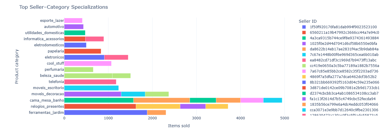
Key insight. Category specialization patterns reveal whether the marketplace is oversupplied or undersupplied in specific verticals, guiding recruitment strategies and category-level investment.
Full SQL — seller category specialization
SELECT
    s.seller_id,
    p.product_category_name,
    COUNT(*) AS items_sold
FROM fact_order_items oi
JOIN dim_product p ON oi.product_id = p.product_id
JOIN dim_seller s ON oi.seller_id = s.seller_id
GROUP BY s.seller_id, p.product_category_name
ORDER BY items_sold DESC;
Business question: How is each seller’s order volume trending over time?
What this measures. For each seller and each month (via DATE_TRUNC('month'))
we count how many orders they fulfilled. The result supports:
- Growth classification (e.g., accelerating vs flat vs declining sellers).
- Forecasting future volume per seller.
- Segmenting sellers by life cycle stage.
Tables used.
fact_orders— purchase timestamps.fact_order_items— ties orders to sellers.dim_seller— seller IDs.
Key SQL ideas.
- Monthly time bucket via
DATE_TRUNC('month', order_purchase_timestamp). - Group by seller_id + month.
- Ordered by (seller_id, month) to feed easily into plotting or window analysis.
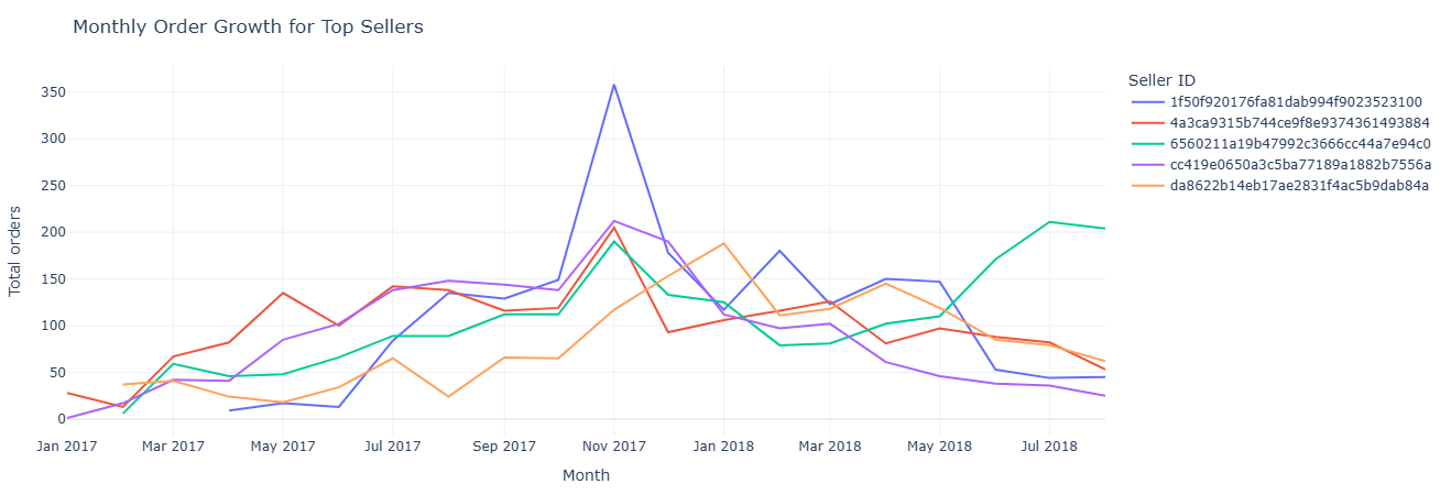
Key insight. Distinct growth trajectories among top sellers help segment who is accelerating, plateauing, or declining—crucial for forecasting and for allocating support or promotional resources.
Full SQL — seller growth over time
SELECT
    s.seller_id,
    DATE_TRUNC('month', CAST(o.order_purchase_timestamp AS TIMESTAMP)) AS month,
    COUNT(*) AS total_orders
FROM fact_orders o
JOIN fact_order_items oi ON o.order_id = oi.order_id
JOIN dim_seller s       ON oi.seller_id = s.seller_id
GROUP BY
    s.seller_id,
    DATE_TRUNC('month', CAST(o.order_purchase_timestamp AS TIMESTAMP))
ORDER BY
    s.seller_id,
    month;
Business question: Which sellers drive the most cancellations and severe delays?
What this measures. For each seller we count:
cancellations— number of orders withorder_status = 'canceled'.severe_delays— number of orders delivered > 10 days after the estimate.
Sorted by severe_delays DESC, cancellations DESC, this becomes a top-risk sellers
list for Ops and CX teams to monitor or intervene on.
Tables used.
fact_orders— statuses, estimated and delivered dates.fact_order_items— link between orders and sellers.dim_seller— seller IDs.
Key SQL ideas.
- Conditional
COUNT(CASE WHEN ... THEN 1 END)pattern for categorical risk flags. - Delay threshold implemented with
DATEDIFF> 10 days. - Single GROUP BY per seller for a compact risk summary.
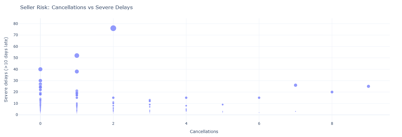
Key insight. Sellers with consistently high cancellations or severe delays represent operational and CX liability. Early detection supports intervention, re-contracting, or traffic throttling before issues scale.
Full SQL — seller risk flags
SELECT
    s.seller_id,
    COUNT(CASE WHEN o.order_status = 'canceled' THEN 1 END) AS cancellations,
    COUNT(
        CASE
            WHEN o.order_delivered_customer_date IS NOT NULL
             AND o.order_estimated_delivery_date IS NOT NULL
             AND DATEDIFF(
                    'day',
                    CAST(o.order_estimated_delivery_date AS DATE),
                    CAST(o.order_delivered_customer_date AS DATE)
                 ) > 10
            THEN 1
        END
    ) AS severe_delays
FROM fact_orders o
JOIN fact_order_items oi ON o.order_id = oi.order_id
JOIN dim_seller s        ON oi.seller_id = s.seller_id
GROUP BY s.seller_id
ORDER BY severe_delays DESC, cancellations DESC;
This notebook leans into the geographic strength of the dataset. It asks: Which states get faster deliveries? Where does revenue actually concentrate? and Which categories are popular in which regions?
- Delivery reliability by state — avg and median delivery days.
- Revenue by state — where demand and GMV live.
- Category popularity by region — regional merchandising signals.
Business question: Which states experience faster vs slower deliveries?
What this measures. For each state we compute:
avg_delivery_days— mean time from purchase to delivery.median_delivery_days— 50th percentile delivery time.total_orders— how many deliveries underpin those stats.
This is a direct “reliability surface” by state, ideal for maps or SLA comparisons.
Tables used.
fact_orders— timestamps for purchase and delivery.dim_customer— customer state.
Key SQL ideas.
- Filtering to
order_delivered_customer_date IS NOT NULLensures we measure only completed deliveries. DATE_DIFF('day', purchase, delivered)metric reused consistently.
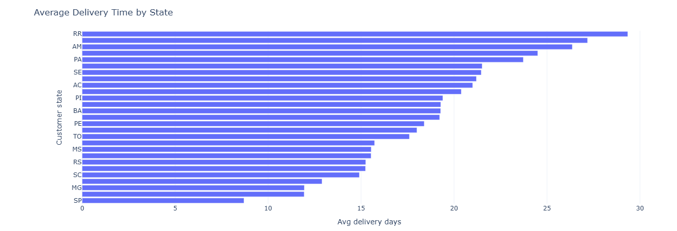
Key insight. State-by-state variance in delivery days quantifies where logistics partners or routes underperform, helping define SLA baselines and prioritize regional optimization.
Full SQL — delivery reliability by state
SELECT
    c.customer_state,
    AVG(DATE_DIFF('day',
        CAST(o.order_purchase_timestamp AS TIMESTAMP),
        CAST(o.order_delivered_customer_date AS TIMESTAMP)
    )) AS avg_delivery_days,
    MEDIAN(DATE_DIFF('day',
        CAST(o.order_purchase_timestamp AS TIMESTAMP),
        CAST(o.order_delivered_customer_date AS TIMESTAMP)
    )) AS median_delivery_days,
    COUNT(*) AS total_orders
FROM fact_orders o
JOIN dim_customer c ON o.customer_id = c.customer_id
WHERE o.order_delivered_customer_date IS NOT NULL
GROUP BY c.customer_state
ORDER BY avg_delivery_days;
Business question: Which states drive the most revenue, and how big are orders there?
What this measures. We first compute per-order revenue as the sum of
price + freight_value from all items. Then we aggregate by state:
total_revenue— GMV per state.avg_order_value— mean order size.num_orders— count of orders from that state.
Combined with delivery-reliability metrics, this informs where to invest in logistics, marketing, and regional partnerships.
Tables used.
fact_order_items— item-level revenue.fact_orders— order IDs.dim_customer— state dimension.
Key SQL ideas.
- CTE
item_totalsbuilds per-order revenue totals. - Main SELECT groups by
customer_statewith sums and averages.
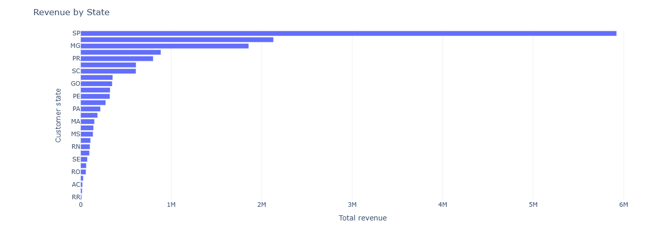
Key insight. Revenue concentration in a few states enables more targeted demand strategies—marketing, inventory placement, and localized ops can all be tuned to where GMV actually lives.
Full SQL — revenue by state
WITH item_totals AS (
    SELECT
        oi.order_id,
        SUM(oi.price + oi.freight_value) AS order_revenue
    FROM fact_order_items oi
    GROUP BY oi.order_id
)
SELECT
    c.customer_state,
    SUM(t.order_revenue) AS total_revenue,
    AVG(t.order_revenue) AS avg_order_value,
    COUNT(*) AS num_orders
FROM fact_orders o
JOIN item_totals t ON o.order_id = t.order_id
JOIN dim_customer c ON o.customer_id = c.customer_id
GROUP BY c.customer_state
ORDER BY total_revenue DESC;
Business question: Which categories are most popular in each state?
What this measures. By grouping on customer_state and
product_category_name, we compute:
num_items— how many items sold for that (state, category).revenue— total price-based revenue per combination.
Sorted by num_items DESC within each state, this acts as a ranked category list per region,
useful for regional curation and localized campaigns.
Tables used.
fact_orders— ties customers to orders.fact_order_items— ties orders to products.dim_customer— state.dim_product— category.
Key SQL ideas.
- Grouping by both state and category to unpack the joint distribution.
- Using
SUM(oi.price)as a simple revenue proxy.
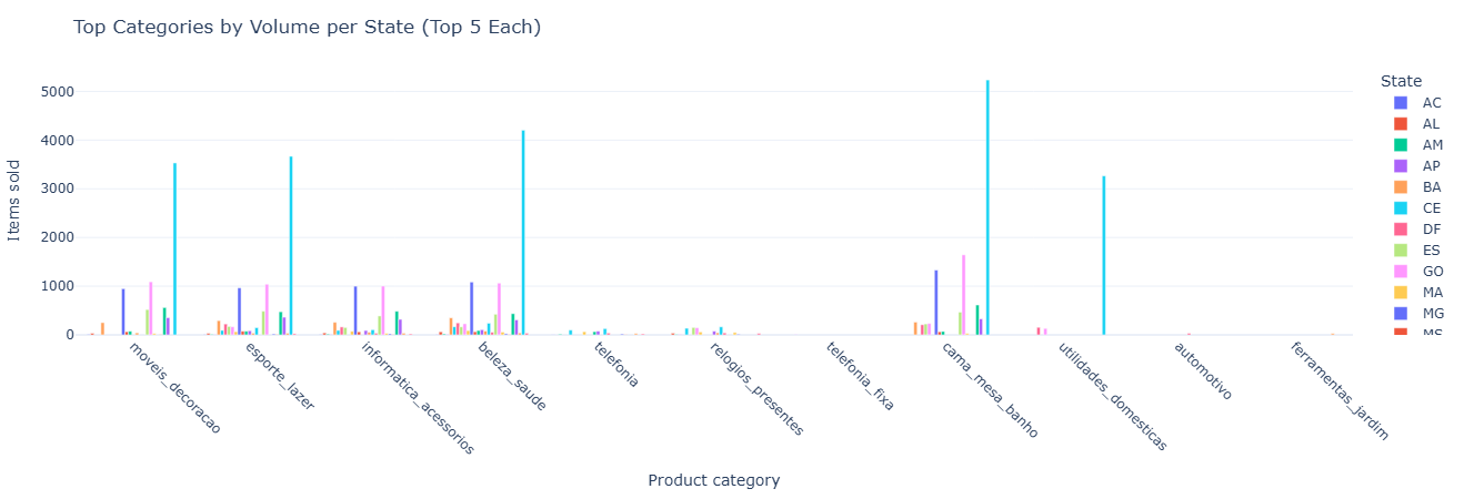
Key insight. Regional differences in top categories surface merchandising opportunities—enabling tailored promotions, localized storefronts, and inventory strategies aligned to actual demand.
Full SQL — category popularity by region
SELECT
    c.customer_state,
    p.product_category_name,
    COUNT(*) AS num_items,
    SUM(oi.price) AS revenue
FROM fact_order_items oi
JOIN fact_orders o       ON oi.order_id = o.order_id
JOIN dim_customer c      ON o.customer_id = c.customer_id
JOIN dim_product p       ON oi.product_id = p.product_id
GROUP BY c.customer_state, p.product_category_name
ORDER BY c.customer_state, num_items DESC;
This notebook puts a time axis under the marketplace: month-by-month trends in revenue, order volume, delivery speed, and review scores, plus category-level seasonality. It’s the backbone for any seasonality, forecasting, or “are we getting better?” conversation.
- Monthly revenue trend — top-line growth and AOV over time.
- Category seasonality — revenue by category × month.
- Review score trends — whether CX is improving or slipping.
- Delivery time trend — changes in speed and reliability.
- Order volume trends — delivered vs canceled over time.
Primary question: How do total revenue, average order value, and order counts evolve month over month?
What this measures. For each month we compute:
total_revenue— sum of payment values.avg_order_value— average revenue per order.num_orders— number of orders in that month.
This lets you see macro revenue trends, peak seasons, and any structural shifts in order value (e.g., moving from many small orders to fewer high-value ones).
Tables used.
fact_orders— order purchase timestamps.fact_payments— payment values per order.
Key SQL ideas.
- CTE
order_revenueaggregates payment_value per order and month. - Grouping by month to compute total and average revenue and order counts.

Key insight. Tracking revenue, AOV, and order counts month by month separates true growth from ticket-mix changes and seasonality, giving finance and ops a clean baseline for forecasts and “are we actually growing?” conversations.
Show SQL: monthly revenue trend
-- 34. Monthly revenue trend
WITH order_revenue AS (
    SELECT
        o.order_id,
        DATE_TRUNC('month', CAST(o.order_purchase_timestamp AS TIMESTAMP)) AS month,
        SUM(p.payment_value) AS order_revenue
    FROM fact_orders o
    JOIN fact_payments p ON o.order_id = p.order_id
    GROUP BY o.order_id, month
)
SELECT
    month,
    SUM(order_revenue)              AS total_revenue,
    AVG(order_revenue)              AS avg_order_value,
    COUNT(*)                        AS num_orders,
    COUNT(DISTINCT month) OVER ()   AS num_months
FROM order_revenue
GROUP BY month
ORDER BY month;
Primary question: Which product categories are seasonal, and when do they peak?
What this measures. For each month × category pair we compute:
revenue— sum ofprice + freight_value.num_items— number of items sold.
By plotting this, you can see seasonal spikes (e.g., electronics in November/December) and identify off-season gaps or cross-sell opportunities.
Tables used.
fact_order_items— item-level revenue proxy.fact_orders— purchase timestamps.dim_product— category names.
Key SQL ideas.
- Truncating purchase timestamps to month.
- Grouping by month and
product_category_namewith a small revenue filter.
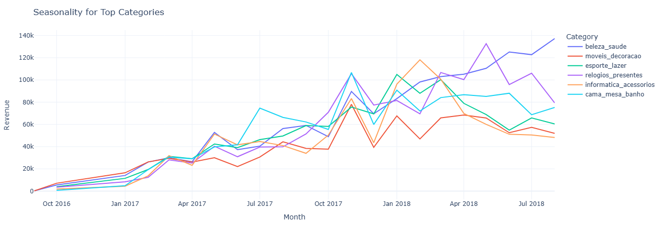
Key insight. Category-level seasonality makes it clear which lines deserve peak-season inventory and marketing support, and which ones should be pushed via off-season promotions or bundled offers when their natural demand is low.
Show SQL: category seasonality
-- 35. Category seasonality (revenue by category & month)
SELECT
    DATE_TRUNC('month', CAST(o.order_purchase_timestamp AS TIMESTAMP)) AS month,
    p.product_category_name                                          AS product_category,
    SUM(oi.price + oi.freight_value)                                 AS revenue,
    COUNT(*)                                                         AS num_items
FROM fact_order_items oi
JOIN fact_orders o   ON oi.order_id  = o.order_id
JOIN dim_product p   ON oi.product_id = p.product_id
GROUP BY month, product_category
HAVING revenue > 0
ORDER BY month, revenue DESC;
Primary question: Are customer reviews getting better, worse, or staying flat over time?
What this measures. For each month, based on
review_creation_date, we compute:
avg_review_score— average rating.num_reviews— number of reviews contributed that month.
This separates “are we improving in CX?” from “are we just getting more reviews?” and is often used alongside operational changes to see impact on perception.
Tables used.
fact_reviews— scores and review creation dates.fact_orders— order context (for joins or filtering).
Key SQL ideas.
- Truncating
review_creation_dateto month for aggregation. - Group by month, then compute averages and counts.
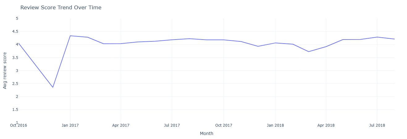
Key insight. A stable or improving review trend signals that CX changes are working, while drops in average score around specific months flag periods where policy, logistics, or catalog changes may have hurt customer perception.
Show SQL: review score trend
-- 36. Review score trends over time
SELECT
    DATE_TRUNC('month', CAST(r.review_creation_date AS TIMESTAMP)) AS month,
    AVG(r.review_score) AS avg_review_score,
    COUNT(*) AS num_reviews
FROM fact_reviews r
JOIN fact_orders o
    ON r.order_id = o.order_id
GROUP BY month
ORDER BY month;
Primary question: Is delivery getting faster or slower over time?
What this measures. For each month (based on purchase timestamp), we compute:
avg_delivery_days— average days from purchase to delivery.delivered_orders— number of delivered orders in that month.
This is your baseline for operational performance improvements or degradations and can be juxtaposed with changes in carrier strategy, SLA, or warehouse footprint.
Tables used.
fact_orders— purchase and delivered timestamps.
Key SQL ideas.
- Filter to orders with non-null
order_delivered_customer_date. - Use
DATE_DIFFbetween purchase and delivered dates, aggregated per month.

Key insight. A stable or improving review trend signals that CX changes are working, while drops in average score around specific months flag periods where policy, logistics, or catalog changes may have hurt customer perception.
Show SQL: delivery time trend
-- 37. Average delivery time by month/year
SELECT
    DATE_TRUNC('month', CAST(o.order_purchase_timestamp AS TIMESTAMP)) AS month,
    AVG(
        DATE_DIFF(
            'day',
            DATE(o.order_purchase_timestamp),
            DATE(o.order_delivered_customer_date)
        )
    ) AS avg_delivery_days,
    COUNT(*) AS delivered_orders
FROM fact_orders o
WHERE o.order_delivered_customer_date IS NOT NULL
GROUP BY month
ORDER BY month;
Primary question: How does order volume evolve over time, and what share is delivered vs canceled?
What this measures. For each month we compute:
total_orders— all orders.delivered_orders—order_status = 'delivered'.canceled_orders—order_status = 'canceled'.
It gives you a high-level operational funnel over time: demand growth plus “friction” from cancellations that might need root cause analysis.
Tables used.
fact_orders— order status & purchase timestamp.
Key SQL ideas.
- Status-based conditional sums for delivered vs canceled.
- Simple monthly aggregation to feed a trend chart.
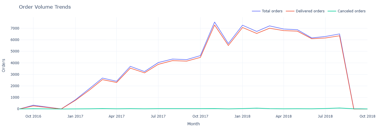
Key insight. Comparing delivered versus canceled order curves shows whether growth is coming from healthy fulfillment or being eroded by friction; spikes in cancellations against flat demand are strong candidates for root-cause analysis.
Show SQL: order volume trend
-- 38. Order volume trends
SELECT
    DATE_TRUNC('month', CAST(order_purchase_timestamp AS TIMESTAMP)) AS month,
    COUNT(*)                                                        AS total_orders,
    SUM(CASE WHEN order_status = 'delivered' THEN 1 ELSE 0 END)    AS delivered_orders,
    SUM(CASE WHEN order_status = 'canceled'  THEN 1 ELSE 0 END)    AS canceled_orders
FROM fact_orders
GROUP BY month
ORDER BY month;
This notebook measures operational discipline: on-time vs late delivery performance against SLA, seller shipping behavior, item-level cost and weight implications, and how many items customers typically include per order. It answers the operational core question: “Are we shipping what we promised — at what cost, and in what form?”
- SLA performance — share of orders delivered on time vs late.
- Seller shipping behavior — average ship time, median, and variance.
- Cost & weight impact — how heavier/bulkier orders affect delivery speed.
- Order structure — typical number of items per order and tail distributions.
- Operational exceptions — patterns behind late, severely late, or high-cost orders.
Primary question: For each order, did we deliver on time relative to the estimated date?
What this measures. For every order with a relevant status we compute:
actual_delivery_days— purchase to delivered.estimated_delivery_days— purchase to estimated date.sla_result—on_time,late, ornot_delivered.
This creates an SLA-ready table that can be further aggregated by carrier, seller, category, or region to see where SLA performance is strongest or weakest.
Tables used.
fact_orders— purchase, delivered, estimated timestamps and status.
Key SQL ideas.
- Conditional
CASElogic to assign SLA outcomes. - Filtering to operationally relevant statuses only (delivered/shipped/invoiced).
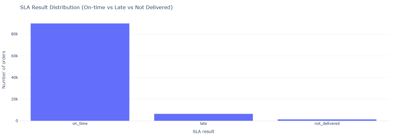
Key insight. A simple on_time / late / not_delivered split quantifies SLA performance at a glance and becomes the core KPI for vendor scorecards, carrier reviews, and any initiative aimed at tightening promised delivery windows.
Show SQL: SLA tracking
SELECT
    o.order_id,
    o.order_status,
    DATE(o.order_purchase_timestamp)          AS purchased_at,
    DATE(o.order_delivered_customer_date)     AS delivered_at,
    DATE(o.order_estimated_delivery_date)     AS estimated_at,

    DATE_DIFF('day', DATE(o.order_purchase_timestamp), DATE(o.order_delivered_customer_date))
        AS actual_delivery_days,

    DATE_DIFF('day', DATE(o.order_purchase_timestamp), DATE(o.order_estimated_delivery_date))
        AS estimated_delivery_days,

    CASE
        WHEN o.order_delivered_customer_date IS NULL THEN 'not_delivered'
        WHEN DATE(o.order_delivered_customer_date) <= DATE(o.order_estimated_delivery_date)
            THEN 'on_time'
        ELSE 'late'
    END AS sla_result
FROM fact_orders o
WHERE o.order_status IN ('delivered', 'shipped', 'invoiced');
Primary question: For each seller, how long does delivery actually take, and how far off are they from estimates?
What this measures. For every seller we compute:
avg_delivery_days— average actual days to deliver.avg_delay_vs_estimate— average delta between delivered and estimated dates.total_orders— number of delivered orders per seller.
This is the seller SLA lens: who reliably beats estimates, who is consistently late, and where to focus seller coaching or contractual changes.
Tables used.
fact_orders,fact_order_items— timestamps and seller linkage.dim_seller— seller IDs and metadata.
Key SQL ideas.
- Using
DATE_DIFFfor both actual delivery and delay vs estimate. - Grouping by
seller_idto get per-seller aggregates.

Key insight. Ranking sellers by average delay versus estimate quickly surfaces who chronically misses promises and who consistently beats them, guiding where to apply coaching, contractual penalties, or preferential traffic and badging.
Show SQL: seller shipping performance
SELECT
    s.seller_id,
    COUNT(*) AS total_orders,
    AVG(
        DATE_DIFF(
            'day',
            DATE(o.order_purchase_timestamp),
            DATE(o.order_delivered_customer_date)
        )
    ) AS avg_delivery_days,
    AVG(
        DATE_DIFF(
            'day',
            DATE(o.order_delivered_customer_date),
            DATE(o.order_estimated_delivery_date)
        )
    ) AS avg_delay_vs_estimate
FROM fact_orders o
JOIN fact_order_items oi ON o.order_id = oi.order_id
JOIN dim_seller s ON oi.seller_id = s.seller_id
WHERE o.order_delivered_customer_date IS NOT NULL
GROUP BY s.seller_id
ORDER BY avg_delay_vs_estimate DESC;
Primary question: Which categories incur higher freight costs or weights, and do they also take longer to deliver?
What this measures. For each category we compute:
avg_freight_value— proxy for shipping cost.avg_weight— average product weight in grams.avg_delivery_days— average days from purchase to delivery.
This helps answer whether heavy/expensive-to-ship categories justifiably have longer delivery windows and whether those windows might need adjustment or tighter control.
Tables used.
fact_orders,fact_order_items— delivery timing and freight value.dim_product— product weight and category attributes.
Key SQL ideas.
- Joining items to products to bring in category and weight.
- Group by category while averaging freight, weight, and delivery days.

Key insight. Linking product weight, freight value, and delivery time shows which categories are legitimately slow and expensive to ship and where SLAs, packaging, or pricing can be improved without breaking the underlying economics.
Show SQL: cost & weight vs delivery days
SELECT
    p.product_category_name,
    AVG(oi.freight_value) AS avg_freight_value,
    AVG(p.product_weight_g) AS avg_weight,
    AVG(
        DATE_DIFF(
            'day',
            DATE(o.order_purchase_timestamp),
            DATE(o.order_delivered_customer_date)
        )
    ) AS avg_delivery_days
FROM fact_orders o
JOIN fact_order_items oi ON o.order_id = oi.order_id
JOIN dim_product p ON oi.product_id = p.product_id
WHERE o.order_delivered_customer_date IS NOT NULL
GROUP BY p.product_category_name
ORDER BY avg_delivery_days DESC;
Primary question: How many items do customers usually buy in a single order?
What this measures. For each order we count how many item lines it has, then
aggregate counts of orders by num_items. This distribution tells you:
- What proportion of orders are single-item vs multi-item.
- How far the long tail of large baskets extends.
It’s a useful baseline for cross-sell / upsell strategies (e.g., “most people buy 1 item; how do we move them to 2?”).
Tables used.
fact_order_items— item lines per order.
Key SQL ideas.
- CTE
item_countscounts items per order. - Final aggregation groups by
num_itemsto get order counts per basket size.

Key insight. Understanding how many orders are single-item versus multi-item quantifies the headroom for cross-sell and basket-building tactics, and helps decide whether to optimize checkout, promos, and logistics for small or large carts.
Show SQL: multi-item order distribution
WITH item_counts AS (
    SELECT
        order_id,
        COUNT(*) AS num_items
    FROM fact_order_items
    GROUP BY order_id
)
SELECT
    num_items,
    COUNT(*) AS num_orders
FROM item_counts
GROUP BY num_items
ORDER BY num_items;
This notebook re-runs core analyses on the _typed fact tables to ensure typed models behave
consistently with business expectations. It acts as both a regression test for your transformation layer
and a demonstration of how standardized, time-typed schemas make analytics more robust and reusable.
- Revenue & order counts — typed vs untyped consistency checks.
- Delivery timing — ensuring typed timestamps preserve business logic.
- Payment alignment — validating payment typing (installments, captured dates, etc.).
- Review alignment — checking review timing and score integrity across typed schema.
- Governance surface — identifying mismatches, null-patterns, and schema drift.
Primary question: On the typed payment table, how do payment types and ticket bands contribute to revenue and order volume?
What this measures. We compute per payment_type and ticket_band:
num_paymentsandnum_orders.avg_order_valueandtotal_revenue.
This mirrors the earlier payment analysis but on fact_payments_typed, ensuring
the typed model yields consistent business answers for payment mix and purchasing behavior.
Tables used.
fact_payments_typed— typed payment fact table withpayment_typeand values.
Key SQL ideas.
- CTE
order_totalscomputes order-level revenue first. ticket_bandcase logic uses a threshold (e.g., ≥ 200 = high_ticket).
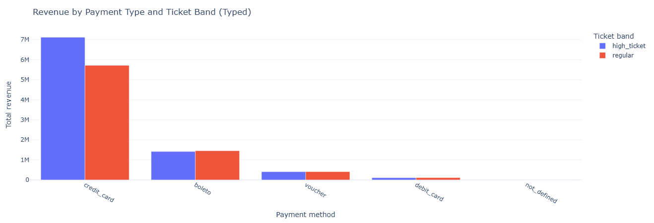
Key insight. Validating payment behavior on the typed model confirms that high-ticket GMV is driven primarily by credit card orders, while lower-value installments and vouchers contribute volume but not revenue—proving that the typed schema preserves real purchasing patterns without drift.
Show SQL: payment mix on typed payments
SELECT
    payment_type,
    ticket_band,
    COUNT(*)                     AS num_payments,
    COUNT(DISTINCT order_id)     AS num_orders,
    AVG(order_value)             AS avg_order_value,
    SUM(order_value)             AS total_revenue
FROM (
    WITH order_totals AS (
        SELECT
            order_id,
            SUM(payment_value) AS order_value
        FROM fact_payments_typed
        GROUP BY order_id
    ),
    labeled_orders AS (
        SELECT
            p.order_id,
            p.payment_type,
            t.order_value,
            CASE
                WHEN t.order_value >= 200 THEN 'high_ticket'
                ELSE 'regular'
            END AS ticket_band
        FROM fact_payments_typed p
        JOIN order_totals t USING (order_id)
    )
    SELECT * FROM labeled_orders
) t
GROUP BY payment_type, ticket_band
ORDER BY total_revenue DESC;
Primary question: Do seller growth curves derived from the typed order model look consistent with the raw model?
What this measures. Using fact_orders_typed and its typed timestamps,
we compute monthly order counts per seller. This should match (or intentionally differ in defined ways
from) the earlier, non-typed version and forms a regression test between layers.
Tables used.
fact_orders_typed— typed order timestamps (order_purchase_ts).fact_order_items_typed— order-to-seller linkage.dim_seller— seller IDs.
Key SQL ideas.
- Use
DATE_TRUNC('month', order_purchase_ts)for monthly buckets. - Group by
seller_idand month to create time-series per seller.
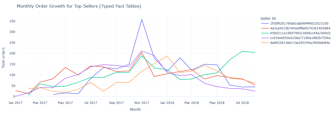
Key insight. Typed timestamps recreate the same seller growth trajectories seen in the raw model, but with cleaner, more stable time buckets—making typed tables a reliable foundation for forecasting, lifecycle modeling, and regression tests between warehouse layers.
Show SQL: seller growth on typed orders
SELECT
    s.seller_id,
    DATE_TRUNC('month', fo.order_purchase_ts) AS month,
    COUNT(*) AS total_orders
FROM fact_orders_typed fo
JOIN fact_order_items_typed foi ON fo.order_id = foi.order_id
JOIN dim_seller s ON foi.seller_id = s.seller_id
GROUP BY s.seller_id, month
ORDER BY s.seller_id, month;
Primary question (part A): On typed orders, which sellers show high cancellation or severe delay risk?
What this measures. For each seller we count:
cancellations— typed orders withorder_status = 'canceled'.severe_delays— orders whereorder_customer_tsoccurs more than 10 days afterorder_estimated_ts.
This mirrors the untyped seller-risk view but using the typed timestamps, validating the new model’s alignment with operational SLAs.
Primary question (part B): Month by month, how do delivery days, estimated days, and “lateness” look on the typed model?
What this measures. For each month (based on order_purchase_ts) we calculate:
avg_delivery_days— purchase to customer delivery.avg_estimated_days— purchase to estimate.avg_late_days— estimate to actual delivery.
This provides a monthly SLA performance trend entirely off typed timestamps, ideal for governance and modeling in dbt-style pipelines.
Tables used.
fact_orders_typed,fact_order_items_typed— typed timestamps and seller linkage.dim_seller— seller reference.
Key SQL ideas.
- Part A uses conditional
COUNTwith a 10-day delay threshold on typed timestamps. - Part B aggregates date differences at the month level to derive SLA metrics.
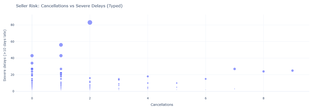
Key insight. Typed delivery and estimate timestamps sharpen SLA reporting, exposing chronic late performers and clarifying month-level delivery patterns; this ensures operational scorecards, penalties, and guarantees are based on consistent, governance-ready time logic.
Show SQL: seller risk & SLA on typed model
-- Seller risk on typed orders
SELECT
    s.seller_id,
    COUNT(CASE WHEN fo.order_status = 'canceled' THEN 1 END) AS cancellations,
    COUNT(
        CASE
            WHEN fo.order_customer_ts  IS NOT NULL
             AND fo.order_estimated_ts IS NOT NULL
             AND fo.order_customer_ts  > fo.order_estimated_ts + INTERVAL '10' DAY
            THEN 1
        END
    ) AS severe_delays
FROM fact_orders_typed fo
JOIN fact_order_items_typed foi ON fo.order_id = foi.order_id
JOIN dim_seller s ON foi.seller_id = s.seller_id
GROUP BY s.seller_id
ORDER BY severe_delays DESC, cancellations DESC;

-- Monthly SLA metrics on typed orders
SELECT
    DATE_TRUNC('month', fo.order_purchase_ts) AS month,
    COUNT(*)                                  AS total_orders,
    AVG(
        DATE_DIFF('day', fo.order_purchase_ts, fo.order_customer_ts)
    )                                         AS avg_delivery_days,
    AVG(
        DATE_DIFF('day', fo.order_purchase_ts, fo.order_estimated_ts)
    )                                         AS avg_estimated_days,
    AVG(
        DATE_DIFF('day', fo.order_estimated_ts, fo.order_customer_ts)
    )                                         AS avg_late_days
FROM fact_orders_typed fo
WHERE fo.order_customer_ts IS NOT NULL
GROUP BY month
ORDER BY month;